The Idea & Visuals
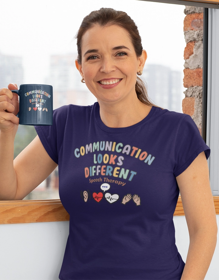
This design centers on the uplifting phrase “Communication Looks Different” displayed in playful, multicolored letters. Just below, the words “Speech Therapy” appear in a smaller arc, bringing focus to the field it celebrates. The artwork is accompanied by a row of icons: an ear with sound waves, two hearts with heartbeat lines, a speech bubble, and a pair of hands raised in gesture. Together, these elements reflect the many ways people connect, from listening and speaking to showing emotions or signing.
(See more in Speech Therapy Awareness)
Who Will Love It
This design will resonate with speech-language pathologists, therapy students, educators, and families who value inclusive communication. It also makes a thoughtful choice for autism awareness events, classroom settings, or as a supportive gift for anyone in the speech therapy community.
Behind the Vibe
The mood is warm and supportive, using soft pastel shades combined with bold outlines to ensure clarity. The friendly lettering and recognizable symbols highlight compassion and diversity, reminding us that every voice matters—whether spoken, signed, or expressed through gestures and emotions.

